There are three kinds of lies: lies, damned lies, and statistics.” This quote from Benjamin Disraeli, Prime Minister of England under Queen Victoria, demonstrates that the field of statistics has needed to defend its honor since its inception in Europe centuries ago.
The original term for statistics, political arithmetic (Best, 2001), might be more accurate. Statistics are rarely neutral. Those who collect them have a purpose—sometimes benign, sometimes not—and translate the information to serve that purpose. For example, some people, including representatives of the pharmaceutical industry, say that statistics reveal an “obesity crisis” in the United States. Other people, including some financed by the food industry, allege that the “obesity crisis” is a false alarm spread by drug companies that want the standards for diseases constantly made stricter so that they can define more people as patients and sell them expensive drugs. It's true that the numbers accepted as indications of high cholesterol, high blood pressure, and high blood sugar have all become much lower in the last decade.
Contradictory claims like these may be one reason why people say that you can prove anything with statistics. You can't, but people will certainly try to prove their particular viewpoints by using only those numbers that serve their purposes.
More Than One Number
You need more than one statistic to get a full picture of just about anything. Educators whose performance is being judged solely by annual standardized test scores will appreciate this point.
As I was writing this, an article in The New York Times gave three statistics for various nations' greenhouse gas emissions: total emissions, per capita emissions, and emissions per industrial output (Barringer, 2006). Using total emissions, the United States is number one by far, with China second and Russia third. Using per capita emissions, the United States is still number one and Russia is still third, but Canada is second. (China has lots of people and is still largely a rural nation despite its rapid urbanization.) Using industrial output, Russia is first, China second, and the United States fifth. (Russian and Chinese industries are not as clean as U.S. industries.)
Which statistic is best? All of them together. Using only one would be like evaluating a center fielder only on his batting average or a quarterback only on yards gained per pass. You need more than one statistic to paint a complete picture.
Similarly, a recent e-mailer asked me whether a preschool program, which produced a four-month gain in vocabulary and math and cost $6,000 per kid per year, was worth it. I said that I couldn't tell. For one thing, the program likely produced health, socialization, and other outcomes besides the two mentioned. In addition, the real value of the program might not be clear for years: It took long-term evaluations of the outcomes of the Perry Preschool Project and the Chicago Family Centers project to establish that society gained about $7 for every dollar invested in these programs (Berrueta-Clement, Schweinhart, Barnett, Epstein, & Weikart, 1984; Reynolds, 2001).
Principles of Data Interpretation
Despite the limitations of individual statistics and public cynicism about being able to prove anything, people remain remarkably trusting when it comes to statistics. Best (2001) observes that “Most of the time, most people simply accept statistics without question” (p. 4). This acceptance would be dangerous at any time, but given today's polarized politicization of education (and virtually everything else), it is particularly hazardous now. Educators can avoid this danger by following some basic principles of data interpretation.
Go Back to the Data
Many people call the National Commission on Excellence in Education's 1983 report A Nation at Risk “the paper Sputnik” because it focused attention on education in the same way Sputnik did in 1954. Some still refer to it today as a “landmark” study. It's a landmark, all right: a golden treasury of selected, spun, distorted, and even manufactured statistics.
After opening with a blast of Cold-Warrior rhetoric, the good commissioners listed 13 indicators of the “risk,” all referring to test scores. For example, “Over half the population of gifted students do not match their tested ability with comparable achievement in school.” Given that achievement tests at the time were the principal means of selecting kids for gifted and talented programs, how could this possibly be true? When I sought an answer from some commissioners and their staff members, no one could remember where this statistic came from. How convenient.
Another statistic was, “Average tested achievement of students graduating from college is also lower.” The United States has no program to test students graduating from college that would yield a statistic showing their “average tested achievement.” What on earth could this mean? These examples illustrate a vital principle of data interpretation: If you find a statement the least bit suspect, ask to see the raw data.
Beware of Selectivity
Some of the other indicators in A Nation at Risk illustrate perhaps the most common misuse of statistics: selecting a statistic that, although accurate in itself, paints an incomplete and misleading picture. For instance, the report claimed that “there was a steady decline in science achievement scores of U.S. 17-year-olds as measured by national assessments in 1969, 1973, and 1977.” This was true.
But the statement refers only to science, and only to 17-year-olds. What about the 9- and 13-year-olds also tested in national assessments? No “steady decline” in science for them. What about math? What about reading? No hint of any decline in either subject for any of the three age groups (National Center for Education Statistics [NCES], 2000).
The commissioners had nine trend lines available from NCES data (three ages times three subjects). Only one could be used to support crisis rhetoric, and that was the only one the commissioners mentioned.
Compare Rhetoric with the Numbers
Perhaps the most dangerous statistic is the one that Joel Best calls the mutant statistic. This statistic begins life as a legitimate datum, but mutates into something new and wrong. Best (2001) gives the example of the claim, widely circulated, that 150,000 women die in the United States each year from anorexia. The U.S. Census Bureau's Statistical Abstract of the United States shows that 55,000 women ages 15–44 die each year of all causes. Even if anorexia had killed all 55,000, given that anorexia mostly affects young women, it is unlikely that we can find another 95,000 anorexia victims younger than 15 and older than 44. In fact, the proper statistic is that 150,000 women suffer from anorexia—and even this number is probably a bit inflated because it was produced by an activist group attempting to call attention to the problem.
Mutant statistics afflict education data as well. Washington Post pundit George Will wrote in one column that almost half of Chicago's public school teachers sent their own children to private schools (Will, 1993a). This was true. The figure was 43 percent at the time, and that was the highest proportion in the United States. (Religion figured strongly in the Chicago teachers' decisions.) But over a period of six months, Will's neurons replaced “Chicago” with “the nation”; in another column, he wrote, “Nationally about half of urban public school teachers with school-age children send their children to private schools” (Will, 1993b). This was not true. According to data from the 2000 Census, 17.5 percent of all urban families and 21.5 percent of urban public school teachers send their children to private schools. The rate ranges from 43.8 percent of teachers in the Philadelphia/Camden metro area down to 1.7 percent in Oklahoma City. In 21 of these top 50 cities, teachers use private schools less than urban families do (Doyle, DeSchryver, & Diepold, 2004).
Will's brain might have been addled by the work of Denis Doyle, whose reports using data from the 1980, 1990, and 2000 censuses have promoted the idea that public school teachers do send their kids to private schools in larger numbers than the general public does (Doyle, 1995; Doyle, DeSchryver, & Diepold, 2004; Doyle & Hartle, 1986). Doyle refers to teachers as “connoisseurs” of education, implying that if they send their kids to private schools, they must know something that the rest of us don't. He writes, With teachers choosing private schools, the truth is self-evident: While they work in public schools, they choose private schools for their own children because they believe they are better. (1995)
This statement creates the impression that all public school teachers in all types of communities use private schools. But if we look beyond the rhetoric to the actual statistics, we find these figures for the United States as a whole (Doyle, 1995; Doyle, DeSchryver, & Diepold, 2004):
Special Topic / How to Avoid Statistical Traps - table
Teachers | General Public | |
|---|---|---|
| 1990 | 12.1 percent | 13.1 percent |
| 2000 | 10.6 percent | 12.1 percent |
The numbers show that teachers made less use of private schools than the general public did. What's more, despite all the lionization of private schools and the demonization of public schools during the 1990s, a smaller proportion of both teachers and the general public had children in private schools in 2000 than in 1990.
Make Sure That Groups Are Comparable
The statistics on the percentages of children sent to private schools point to another principle of data interpretation: When comparing groups, make sure the groups are comparable. Teachers and the general public are not comparable. Teachers are more likely to have at least a bachelor's degree and less likely to live below the poverty line. We need to consider the implications of these and similar factors before we draw conclusions about the two groups' public school-private school choices.
This principle often comes into play in figuring out the impact of high-stakes graduation tests. In 2004, Massachusetts announced that 96 percent of its seniors had passed the state test and would graduate. This was true, but it was true only for people who had begun the 2003–2004 school year as seniors and who were still in school. Many in the class of 2004 were no longer present and accounted for. When that cohort of students started 9th grade, it contained 78,000 students; by the time it reached 12th grade, there were only 60,000. Eighteen thousand students had decamped (Wheelock, 2004).
We don't know what happened to these students. Some, of course, left the state and might well have passed the test and graduated if they had remained. But others were retained in grade and were no longer in the class of 2004. Some failed and dropped out or sought a General Equivalency Diploma. If we look at how many who started as 9th graders in the class of 2004 eventually graduated, we find rates ranging from 54 percent for Latino students to 80 percent for white students (Wheelock, 2004). We can't draw an accurate conclusion about the effects of high school graduation exams unless we consider all the groups, including those that did not graduate on time.
Status Quote
Status Quote - Special Topic / How to Avoid Statistical Traps
It is impossible for a man to learn what he thinks he already knows.
—Epictetus
Know the Difference Between Rates and Scores
The Massachusetts example also illustrates another principle of data interpretation: Be aware of whether you are dealing with rates or scores. The two metrics can paint very different pictures of a situation. These days, most states are reporting some kind of rate: percent passing, percent proficient, or percent meeting state standards. But if we focus only on the proficiency cutoff, it doesn't matter whether the student exceeds it by one question or 40. We're looking at how many kids can jump over the barrier, not at how high they jump.
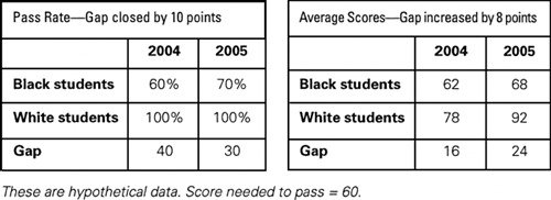
Moreover, using passing rates instead of scores can obscure the fact that the white-minority achievement gap may be increasing. Consider the theoretical data in Figure 1. If we look only at passing rates, black students have reduced the gap from 40 percent to 30 percent. But if we look at scores, the gap has actually increased from 16 points to 24 points.
Figure 1. Pass Rates and Average Scores Tell a Different Story
This discrepancy might not be so important if the passing score actually meant something in terms of performance in the real world. But it doesn't. These passing scores are totally arbitrary. Some readers might recall that in my recent report on the condition of public education (Bracey, 2005), I awarded a Golden Apple to a student in Ohio because he refused to take the Ohio Proficiency Tests. It was not his act of defiance that garnered him a prize; it was the reasons he gave: In 13 years of testing, Ohio has failed to conduct any studies linking scores on the proficiency test to college acceptance rates, dropout rates, college grades, income levels, incarceration rates, scores on military recruiting tests, or any other similar statistic. [The student was admitted to several colleges.] (p. 140)
Do the Arithmetic
Here's a final principle of data interpretation to examine on your own: Do the arithmetic. In 1995, an article in an education periodical (not Educational Leadership) stated that “Every year since 1950, the number of American children gunned down has doubled.” Sit down with a calculator and a sheet of paper on which you write in one column the years from 1950 to 1994. Then assume that one child was “gunned down” in 1950 and let the figure double for each successive year. Have fun.