Most parents and teachers believe that students should study mathematics because it prepares them to be logical thinkers who can apply mathematical skills in the real world. The National Council of Teachers of Mathematics (NCTM, 1989) has similar goals, advocating that problem solving, reasoning, communications, and connections—among math topics and to other disciplines—be woven throughout K–12 mathematics instruction.
Technology helps teachers make these interdisciplinary connections by providing ready access to worthwhile data. In addition, technology facilitates an in-depth exploration of mathematical topics previously too complex for typical classrooms, especially when they involve real-world, "messy" data. For example, multimedia CD-ROMs and the Internet allow teachers and students to gather real-world information quickly. Spreadsheets and graphing calculators expedite open-ended data analysis and simulations of applied situations.
To demonstrate this connective power, we present the following examples that show how students can use technology to gather and interpret information, perform descriptive and graphical analysis, make statistical predictions and inferences, and create and use simulations.
Gathering and Interpreting Information
Technology makes a vast amount of information readily available. Teachers and students can quickly transport data from CD-ROMs and the Internet into spreadsheets, word processors, and multimedia presentations, or they can view these data from the computer screen by using a projection system. Simplifying data gathering allows more time for analyzing and interpreting data. For example, students can go to the National Center for Health Statistics Web site (http://www.cdc.gov/nchswww), access information on the number of live births in the United States, display and analyze the data in a spreadsheet, and connect their analysis to events in U.S. history.
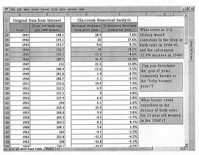
The spreadsheet in Figure 1 contains birth-rate data for 23-year-old women from 1940 through 1967 and the calculated absolute and relative yearly increases and decreases. Using such data helps students learn about population trends as well as understand "percent increase" and "percent decrease" by giving the numerators and denominators contextual meaning and by connecting the calculations with interpretations of the data.
Figure 1. Birth Rate Data 1940–1967, a Numerical Analysis, and Interdisciplinary Questions
Other current and archived data are available on the Internet at the sites of the National Oceanic and Atmospheric Administration (http://www.noaa.gov) and the National Geophysical Data Center (http://www.ngdc.noaa.gov). Teachers can use much of the data at these two sites to facilitate connections among mathematics, science, and geography. For example, students can relate oscillating functions in mathematics to the tides, planetary orbits, and average monthly temperatures. Likewise, multimedia CD-ROM atlases put authentic statistical information at students' fingertips. Students can access information about a country's agricultural production, economy, energy resources, physical landscape, and transportation capabilities. Students can use such real-world information to study percentages, ratios, and proportions in context so that they can make connections, inferences, predictions, comparisons, and hypotheses on the basis of an interdisciplinary analysis of the information.
Making Descriptive and Graphical Analyses
Once students gather their data, electronically or otherwise, they can use graphing calculators and spreadsheets to quickly generate a graphical representation for subsequent analysis. As mentioned earlier, teachers can easily connect oscillating functions in mathematics with geography by having students analyze average monthly temperatures. Figure 2 shows temperature data in tabular and graphical form for Washington, D.C.; Verhoyansk, Russia; and Buenos Aires, Argentina.
Figure 2. Average Monthly Temperature Data and Graph for Three Cities
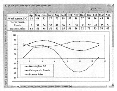
From the graph, we see that the average monthly temperatures for all three cities oscillate with a period of one year, that Verhoyansk is colder than Washington, and that the temperatures in Washington and Buenos Aires are "out of phase." Students can discuss the geographical locations of the cities and analyze the data in terms of latitude and longitude. Students can also fit a sine curve to each city's data (that is, determine the amplitude, period, and vertical and horizontal shifts) and relate the coefficients in the equation to the geographical locations of the cities. By entering these data into a graphing calculator, students can calculate a sine regression and compare the equation generated by the calculator with the equation they generated with the data and the graph.
Technology also allows students to quickly change aspects of a graph to examine different interpretations of data. At the Centers for Disease Control and Prevention Web site (http://www.cdc.gov), they can find data on new AIDS cases reported from 1981 through 1996. After entering this information into a graphing calculator, they can manipulate the scale of the graph to expose or hide certain trends (fig. 3). In mathematics, social studies, or health classes, they might discuss how this manipulation affects graph construction, the appearance of the slope, and the interpretation of the data. They may also speculate about when and why people may choose to use certain graphs in publications and presentations, for example, to maximize or minimize the appearance of growth. Such experiences make students aware that they must look at the scales of graphs and consider the sources of graphs before they can judge the appropriateness of any argument being supported or refuted by graphically displayed data.
Figure 3. Differently Scaled Graphs of New AIDS Cases 1981–1996

Newspapers and magazines are full of charts and graphs displaying data and statistics related to health, politics, and sports. Using the graphing capabilities of various technologies prepares students to be critical consumers of such descriptive and graphical information. Without technology, such explorations would be more time-consuming and tedious and less exploratory and interactive.
Making Statistical Predictions and Inferences
Just as students need to be informed and critical consumers of graphical information, they also need to be able to interpret statistical predictions and inferences. Graphing calculators and spreadsheets help students understand the statistics used in making such predictions and inferences. For example, during the 1997 Virginia governor campaign, the Charlottesville Daily Progress reported the results of a Mason-Dixon Political/Media Research telephone poll of 813 registered voters. The pollsters reported "44 percent of those surveyed favoring Gilmore, 43 percent favoring Beyer, and 13 percent undecided." The newspaper stated that the results had "a margin of error no more than plus or minus 3.5 percentage points."
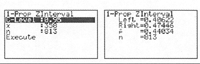
Students can use graphing calculators with statistical features to verify such statements, to discover the unreported confidence interval used by the pollsters, and to explore how sample size can affect the margin of error. The first screenshot in Figure 4 shows the input for a one-proportion z-test using a 95 percent confidence interval when 813 voters are polled and 358 (44 percent of 813) express a preference for Gilmore. The second screenshot displays the results. Notice that the estimated population proportion (p) favoring Gilmore is 44 percent. The 95 percent confidence interval tells us that 95 percent of the time, between 40.6 percent and 47.4 percent of the sample population would favor Gilmore.
Figure 4. Calculation of Margin of Error
Graphing calculators enable teachers and students to focus on underlying statistics and their applications rather than on lengthy mathematical algorithms. Students can systematically vary sample size, confidence levels, and sample proportions to determine reasonable sample sizes. For example, by varying only the sample size, students can observe the subsequent decreases in the margin of error (Table 1) and discuss whether it is worth the time and expense of increasing the sample size from 1,000 to 10,000; that is, they can explore the concept of the point of diminishing returns.
Table 1. Sample Size and Margin of Error
Not Your Typical Math Class - table
Sample Size | Margin of Error |
|---|---|
| n = 100 | ±10 |
| n = 200 | ±7 |
| n = 500 | ±4.3 |
| n = 1,000 | ±3 |
| n = 10,000 | ±1 |
Statistical features of spreadsheets and graphing calculators also contain correlation and regression functions that students can use to explore whether two phenomena are directly or inversely related. These technologies empower students and teachers to investigate questions that reflect their own interests. The following example involves a politically charged topic: court cases and medical studies about the relationship between smoking and lung cancer. In the 1970s, government statisticians in England studied thousands of men from 25 occupational groups and reported data on smoking levels and mortality from lung cancer (Moore & McCabe, 1989). Spreadsheets allow students to explore the relationship between these variables by calculating the correlation coefficient, the equation for the line of best fit (using least-squares linear regression), and the predicted values for the mortality index (fig. 5). Students can connect their analysis of the data with topics related to health, sociology, and career education.
Figure 5. Graphical Display of the Relationship Between Smoking and Mortality from Lung Cancer
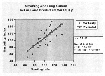
By examining the correlation coefficient between the smoking and the mortality indices, students can infer that a moderately strong positive relationship exists between the two indices, although they cannot determine causation from correlational data. Students can also use a spreadsheet to determine the equation for the line of best fit and predict the mortality index if a smoking index for an occupational group is known.
By using the statistical features in graphing calculators and spreadsheets, students can experience firsthand how statistics are used to make predictions and inferences and can discuss how to correctly interpret and report statistical results.
Creating and Using Simulations
Another powerful feature of technology is its ability to let students make interdisciplinary connections by electronically simulating real-world events. With graphing calculators, spreadsheets, and the Internet, students and teachers can create and use simulations and thus visualize and explore important connections among mathematics, social studies, and science in relatively open-ended environments. One graphing calculator simulation explores exponential functions by applying them to investment strategies and the study of economics. Students explore the effects of investing $1,000 over 20 years in money market, bond, or stock mutual funds. Varying degrees of risk are connected with each type of fund. To weigh risk versus return, students estimate the average return for each investment over the next 20 years, assuming monthly compounding and growth rates of 5 percent, 8 percent, and 16 percent, respectively (fig. 6).
Figure 6. Growth of $1000 over 20 Years at 5%, 8%, and 16%. (Note how the y-value changes)

Although an oversimplification of actual investment returns, this activity is instructive. Economics students observe that after 20 years, the difference in accumulations are dramatic at $2,700 (money market), $4,926 (bond), and $24,019 (stock). Students are then prepared to discuss the volatility of stocks and to weigh the risks versus the returns. Technology makes this activity dynamic because students watch their money "grow" as the number of years increases.
The Internet can also facilitate the teaching and learning of economics. For example, for a study of the stock market, the Internet supplies a wealth of real-time and archived investment information with which students can monitor stock activity, analyze past trends numerically and graphically, and participate in the stock market interactively. The Web site known as InvestSmart (http://library.advanced.org/10326/market_simulation/index.html) offers a simulation in which students can participate in the stock market without the risks associated with investing real money. This site also offers investment examples, online lessons, and real-time stock market information. By using the simulations on the Internet, students and teachers focus on analyzing trends and making decisions without the need to gather and chart stock prices by hand.
Physical events can also be simulated through technology. For example, the study of parametric equations and trigonometry can be connected with the study of projectile motion in physics. The spreadsheet in Figure 7 was created in Microsoft Excel to dynamically simulate projectile motion. Students can manipulate the initial velocity, the angle of projection, and the height from the ground to observe the effects on the subsequent path of an object.
Figure 7. Excel Spreadsheet Created to Analyze Projectile Motion
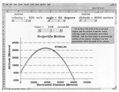
With the ability to manipulate time, students can animate the motion of the object and explore how long it takes for the object to reach its maximum altitude and when the object will hit the ground. By varying the other parameters, the students can explore how each one affects the path of the object and which values maximize or minimize altitude and horizontal distance. Manipulating different parameters and visualizing the path of the object can make the mathematical equations used to describe projectile motion more meaningful. In this way, creating and using such a simulation allow teachers and students to explore mathematical and physical relationships in an open-ended environment and to use higher-order thinking skills to analyze those relationships.
Supporting Understanding
Technology in mathematics teaching should support and facilitate conceptual development, exploration, reasoning, and problem solving. However, technology should not be used to carry out procedures without appropriate mathematical and technological understanding, such as inserting rote formulas into spreadsheets, nor should it be used in ways that compromise sound teaching practices. In the foregoing examples, technology is not the focus of learning. Rather, it empowers teachers and students to explore mathematical concepts through realistic applications and connections to other disciplines. These types of explorations help teachers prepare students to become logical thinkers who are able to apply mathematics in the real world.